Leaderboard · Product designer · 2025
A hiring challenge, taken all the way to handoff.
The design challenge MoveUp Media gave me while I was interviewing: a gamified leaderboard, taken from research to a design system, mobile and desktop prototypes and an annotated handoff. It got me the job, and part of its thinking lives on in Lebi.
The Figma file as delivered. Every note and screen is the original.
- components in the design system
- 105
- annotated design decisions
- 31
- prototyped mobile screens
- 23
- prototypes, mobile and desktop
- 2
Overview
MoveUp Media gave me this challenge during the interviews, while the company was in the early stages of Lebi: design a leaderboard. I treated it as a real product. Research and a mood board first, then an atomic design system built from vectors I drew myself, every flow prototyped on mobile and desktop, and a handoff that explains each decision next to the UI it belongs to. It got me the job, and part of its thinking was adopted by Lebi.
Opportunities
More than standings
How might we turn a list of names and points into a place to compare, follow and talk to other players?
Status worth chasing
How might we make rank feel like an achievement, from the podium to the next class badge?
Find yourself fast
How might we keep every player one tap from their own position, however far down the list?
Movement at a glance
How might we make climbs and drops readable without studying the numbers?
A file that explains itself
How might we hand over a design that carries its own reasoning, flow by flow?
Approach
- 01
Research first
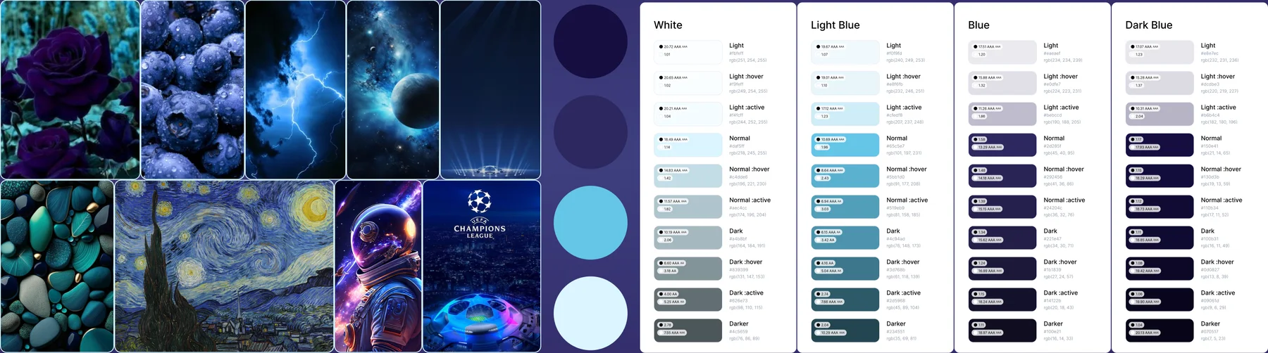
I benchmarked leaderboards in sports platforms and video games, from football and basketball to golf, boxing and Formula 1. Most only listed names and positions, with no way to compare stats, interact or build a community. That gap became the brief. The palette took its cue from the UEFA Champions League: deep blue for trust and precision, violet for a premium feel.
- 02
A system before screens
Before the screens I built the system, atom by atom: color styles, then icons, class badges and rank shields drawn from my own vectors, then rows, cards and whole sections. 105 components, each with its states. The ranking row alone has seven, from climbing and dropping to you and chat.
- 03
Motion with a purpose
Each animation explains something. The Top 3 shrink as you scroll and keep their colors, a player who climbs turns green and one who drops turns red, your row stays pinned to the bottom, and one tap scrolls to your exact rank. Tapping rank 1 brings the podium back.
The motion, rebuilt from the Figma components for this case study. - 04
A handoff that explains itself
Every decision sits next to the UI it explains, 31 notes in all, and the navigation is wired to each flow it opens. The file reads like a spec: what each element is, why it is there and how it behaves.
- 05
Prototyped end to end
Both prototypes work. On mobile: the leaderboard, player cards, compare stats, chat, your card and the trophy room. On desktop, everything on one screen. Try them yourself from the links above.
Screens captured from the Figma prototype. - 06
One screen on desktop
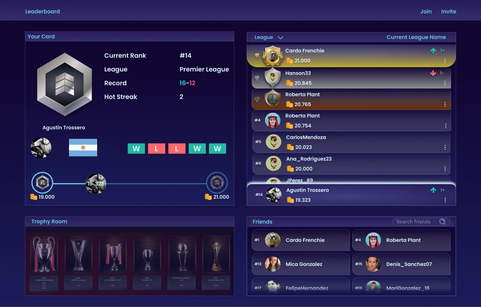
On desktop every section shares one screen. Your card stays in place, and choosing a player turns it into a compare view instead of opening a new page.
Impact & Outcomes
- It got me the job: MoveUp Media hired me after this challenge.
- Part of its thinking was adopted by Lebi, the product MoveUp was starting at the time.
- A file that reads as a spec: research, a 105 component system, 31 annotated decisions and two working prototypes.
Next case · Lumio
Stop betting in the dark.